Gala Pocket Inc.
(Tokyo, Japan)
Gala Pocket is GALA Group's smartphone and tablet game publisher.
With a plan to create a global social gamification platform for otaku, Gala Pocket Inc. dedicated 2 years for global UX research and developing large scale prototypes.
I joined the global product team as a lead UX interface specialist (remote contractor) and was focusing on absorbing ongoing dialog between users and Producers, responding to their feedback, and crafting iOS and android prototypes. With tens of millions of submissions to be received by the app, it was crucial to put the user first.
See Gala Pocket Inc. Twitter
My work process
• Research (Who are the users? What is the product? What are the goals?)
• Document
• Collaborate and build relationships (users, stakeholders, producers, devs and engineers)
• Create early wireframes for fundamentally different iOS and android platforms
• Iterate & test (user test where possible)
• Create user flows and visualise app IA (keep everyone in the loop, to prevent big surprises)
• Iterate & test (user test where possible)
• Handover for implementation
• Support implementation (project has been ceased before reaching this stage)
What was I asked to do?
Create a new OtaQ app prototype (or amend existing if possible) applying a user centred design approach (based on research) and prepare it for implementation.
What did I inherit?
A slideshow with product goal description in Japanese.

What research did I do?
Created a blueprint - mapped all the user touchpoints with the prototype.
Benefit: Visualization of the path followed by consumers may help to spot flaws and improve the flow.
Created a Consumer Journey Map - mapped out steps taken by OtaQ user as they engage with the service.
Benefit: It allowed me to frame the consumer's motivations and needs in each step of the journey.
Performed Stakeholders Interviews - gathered insights about their goals.
Benefit: It helped to prioritize features visually.
Mapped user flow - created a visual representation of the user's flow to complete tasks within the product.
Benefit: It helped to determine which steps from user perspective could be improved or redesigned.
Visualised taxonomy - explored multiple ways to categorize content and data.
Benefit: It helped to defining the content structure to support the user's and the organization’s goals.
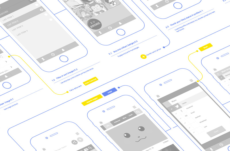
Created wireframes - visualised app structure, feature hierarchy and key elements.
Benefit: Useful to discuss ideas with team members and clients, and to assist the work of developers.
Eventually Created the new Prototype - crafted a simulation of the app navigation and features, a complete layout.
Benefit: It gave us an opportunity to test and validate the app before fully developing it.

Suggestions.. How might the project proceed..
• Create a predictable, simple and beautiful interaction
• Meaningfully group information
• Avoid complication
• Reveal complexity progressively
