Storyful Newswire
(Dublin, Ireland)
Storyful is News Corp's social media storytelling company.
During my time in Storyful I gathered some unique and epic experiences.
I was working on a social story telling platform in creative and agile team. Working in such a diverse and global company helped me to focus on the main mission of my work as a designer: having a customer-centric mindset and ultimately serve the people who use my products and facilitate and improve their daily work. They inspire my work.
On a daily basis I bridged the gap between business decision makers, developers, stakeholders and users. I was the person who figures out the best way to solve big problems without leaving the needs of the most important stakeholders (the users)behind.
See Storyful.com
My work process
• Research (Who are the users? What is the product? What are the goals?)
• Document
• Collaborate and build relationships (users, stakeholders, product owners, devs and engineers)
• Create early feature wireframes
• Iterate & test (user test where possible)
• Create user flows and visualise the features (keep everyone in the loop, to prevent big surprises)
• Iterate & test (user test where possible)
• Handover for implementation
• Support implementation
What was I asked to do?
Improve product Visual and UI bearing in mind the unique user expectations (journalists), apply user centred design approach (based on research) and prepare features for implementation.
What did I inherit?
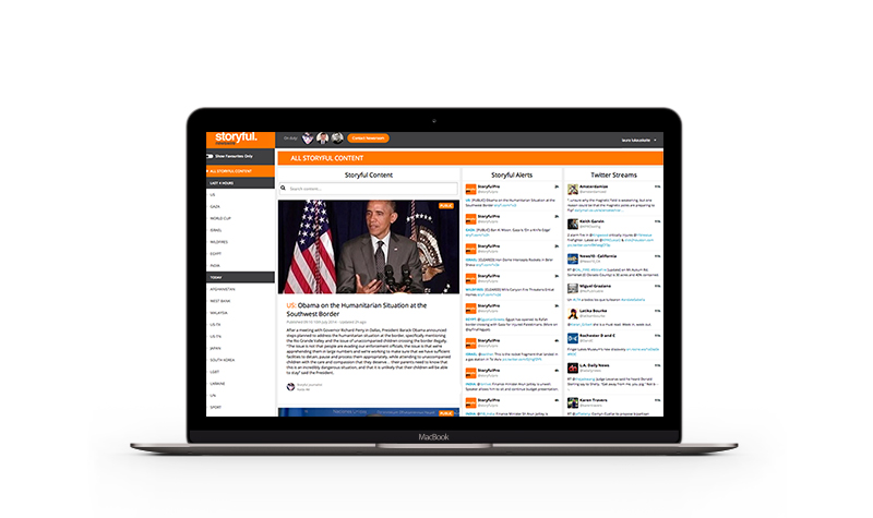
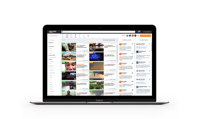
A functional well established social story telling app - Newswire.
What research did I do?
Explored initial Personas created by Product Owner (Q1) - personas were targeting audience demographics, behaviors, needs and motivations using segmentation.
Benefit: This investigation made it easier for me to create empathy with consumers throughout the design process.
Explored initial Competitive Audit documentation created by Product Owner (Q1) - read throught comprehensive analysis of competitor products that maped out their existing features in a comparable way.
Benefit: It helped me to quickly understand industry standards and identify opportunities to innovate in a given area.
Performed Visual Competitive Audit against main competitors and started making recommendations matching industry standards (Q1)
Benefit: This helped me to create design vision and plan matching industry standards and Storyful's brand guidelines.
Got acquainted with Key Performance Indicators (Q1) - made sure I understood business criteria to measure progress toward strategic goals or the maitenance of operational goals before starting any work.
Benefit: Having clear undesranding about KPIs helped me to make the design decisions along the way and measure results of the UX efforts.
Created wireframes (Q1, Q2, Q3, Q4) - visualised app structure, feature hierarchy and key elements.
Benefit: Useful to discuss ideas with team members and stakeholders, and to assist the work of developers.
Mapped user flow for specific features (Q1, Q2, Q3, Q4) - created a visual representation of the user's flow to complete tasks within the product.
Benefit: It helped to determine which steps from user perspective could be improved or redesigned.
Performed Content Audit (Q2) - maintenance was required when design inconsistencies occured. Listing out all content available on an app made the audit much easyer.
Benefit: I referred to Content Audit list multiple occasions after I created it as it came in handy at various stages of the project: helped to see the big picture, define the content strategy and check the details of each page. (Q2, Q3, Q4)
Prototyped (Q1, Q2, Q3, Q4) - crafted a simulation of the app navigation and features, a complete layout.
Benefit: It gave us an opportunity to test features before fully developing them.
Kept up to date with Metrics (Q1, Q2, Q3, Q4) - data provided by an analytics tool gave an undertanding how the users are interacting with the product: clicks, navigation time, search queries etc. Data also alerted when the users did not understand how to interact with a product - clicking the download button twice bacause it didnt feel like it worked the first time.
Benefit: Metrics and data are awesome and it also "uncovers the unexpected", surfacing behaviors that are not explicit in user tests.
Kept up to date with Eyetracking and heatmaps (Q1, Q2, Q3, Q4) - While app did not have an integrated technology that analyzes the user's eye movements across the interface I took the courtesy of using an external design tool that calculates and projects aproximate eye tracking map.
Benefit: Eyetracking and heatmap provide crucial data about what keeps users interested on the screen and how their reading flow could be optmized by design. This information assited me in make a lot of design descisions.
Performed A/B Testing (Q3) - A/B testing served as a great opportunity to offering alternative visual versions of our app to different users and comparing the results to find out which one performs better.
Benefit: It helped to optimize funnels.
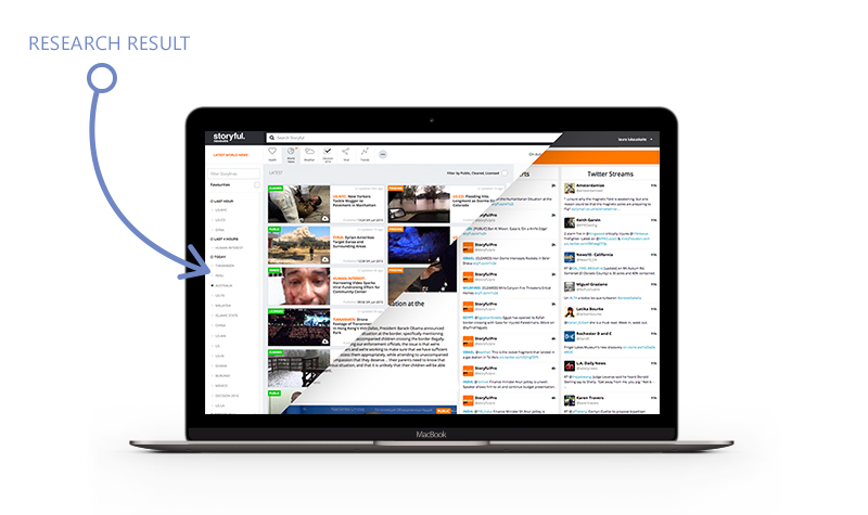
After a few months of research iteration product was optimized:
What design rules did I establish?
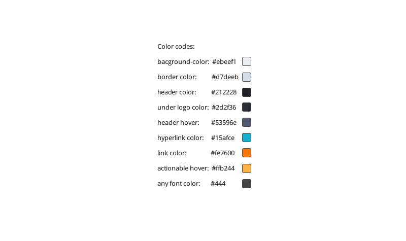
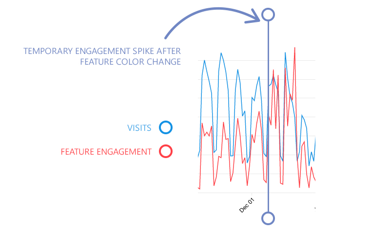
I applied color theory guidelines and created color hierarchy rules.
Agile and Iterative design
In creative and agile environment direction and scope changes are common. It is crucial to focus on absorbing ongoing dialog between users and Product Owners, respond to their feedback, work in a cyclic process of prototyping, testing, analyzing, and refining a product and process.
Suggestions.. How might the project proceed..
• Create a predictable, simple and beautiful interaction
• Meaningfully group information
• Avoid complication
• Reveal complexity progressively
Read more about Mark Little - founder of Storyful
Read more about News Corp here
Read more about Facebook Newswire
Read more about Google News Lab and Storyful
See Youtube Newswire here
Read more about INMA global innovation award for Storyful